
Your cart is currently empty!
What is the Types of C-Pattern in Web Design
Understanding the C-Pattern in Web Design: Layouts That Guide User Attention
Introduction
When it comes to creating websites that convert visitors into customers, understanding visual flow is crucial. Designers often rely on eye-tracking studies to structure layouts that follow natural human reading behavior. One of the most effective — yet lesser-known — layouts is the C-pattern in web design.
While patterns like F-pattern and Z-pattern are well-known, the C-pattern combines readability and aesthetics for content-heavy or product-driven websites. Let’s explore what it means, when to use it, and how it compares to other web design structures.
🧠 What Is the C-Pattern in Web Design?
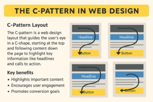
The C-pattern layout is based on how users’ eyes typically move across a webpage — starting from the top-left corner, curving across the center, and finishing at the bottom-right corner, forming a natural “C” shape.
This design flow emphasizes:
- Top Navigation Area: Where users first look for the brand logo, menu, or key information.
- Central Visual Zone: Where primary visuals, headlines, and calls-to-action (CTAs) attract attention.
- Right Edge / Lower Area: Where users decide whether to engage — click, buy, or subscribe.
It creates a balanced, visual rhythm that leads the visitor through your website without overwhelming them.
🧭 How the C-Pattern Works
Eye-tracking studies show that visitors on modern websites don’t always scan linearly (like in books). Instead, they make curved, looping movements, especially on sites with imagery, graphics, or videos.
A typical C-pattern layout includes:
- Header Section: Logo, menu, and a hero image.
- Mid Section: Text or visual content aligned slightly left, encouraging curved eye movement.
- Right or Bottom Corner: CTA button or key offer (e.g., “Book Now” or “Get a Quote”).
This layout works exceptionally well for service-oriented websites, portfolios, or product landing pages where visuals dominate.
🧩 Comparison: C-Pattern vs. Other Layout Patterns
| Pattern | Shape | Ideal For | Visual Flow | Focus Point |
|---|---|---|---|---|
| F-Pattern | F-shape | Text-heavy sites (blogs, news) | Horizontal then vertical | Top-left content |
| Z-Pattern | Z-shape | Simple landing pages | Top-left → diagonal → bottom-right | CTA button |
| C-Pattern | C-shape | Visual + content balance | Top-left → mid visual → bottom-right | Visual & CTA |
🔹 F-Pattern
Best for blog posts, media sites, and articles. It matches traditional reading patterns.
🔹 Z-Pattern
Ideal for simple, single-page designs or hero banners — guiding users directly to CTAs.
🔹 C-Pattern
Perfect for creative agencies, eCommerce stores, or service websites that use visuals and text equally.
🧱 When to Use a C-Pattern Layout
You should use a C-pattern layout when:
- You have a visual-centric website (graphics, photography, product showcases).
- You want to maintain flow between images and content.
- You’re designing homepage layouts or portfolio sections.
- You need to balance visual storytelling and calls-to-action.
Best suited for industries like:
- Creative agencies & portfolios
- Fashion & lifestyle brands
- Architecture & interior design
- Hospitality & travel
- Product landing pages
🎨 Designing with the C-Pattern in Mind
Here’s how to apply this pattern effectively:
- Highlight the Logo and Headline (Top-Left)
Use your logo and a strong headline here — the starting point of the C-curve. - Use Strong Central Imagery
Your hero section or featured product image should sit in the middle area, slightly left-aligned. - Guide Eyes Toward the CTA (Bottom-Right)
Place your most important call-to-action — “Contact Us,” “Buy Now,” or “Request a Quote” — at the end of the curve. - Maintain Whitespace
The “C” path requires open space to maintain visual flow. Don’t clutter the center. - Use Curved Visual Elements
Rounded borders, circular images, or curved text paths reinforce the C-shaped eye motion.
🧾 Example: How Arkido Web Services Uses C-Pattern Design
At Arkido Web Services, we often implement the C-pattern layout in business and creative websites for clients in {{placeholder_name}} and beyond.
For example:
- A product landing page uses top-left navigation, mid-screen product visuals, and a “Buy Now” button aligned to the bottom-right corner.
- A portfolio website uses central image galleries that lead naturally toward contact or inquiry buttons on the right.
This helps users connect emotionally with visuals while still leading them to take action.
🖼️ Infographic: The C-Pattern vs. F-Pattern vs. Z-Pattern
📊 (Use the infographic you generated above — titled “The C-Pattern in Web Design”)
The infographic visually demonstrates how:
- The F-pattern focuses on scanning text-heavy content.
- The Z-pattern creates a fast, directional flow for CTAs.
- The C-pattern provides a smooth visual path for balanced design layouts.
This helps teams and clients easily visualize how layout patterns impact user journey and engagement.
💡 Tips for Implementing the C-Pattern on Your Website
- Use eye-catching hero images in the top or central section.
- Keep the main CTA button visible in the lower right.
- Combine visuals and short, benefit-driven text.
- Use consistent spacing and hierarchy.
- Test the layout with heatmap tools to confirm user flow.
📈 Benefits of Using the C-Pattern in Web Design
✅ Enhances visual storytelling
✅ Improves user engagement
✅ Balances text and imagery
✅ Increases conversion opportunities
✅ Works great on all screen sizes
In essence, the C-pattern makes websites look modern, intuitive, and easy to navigate — without overwhelming visitors.
🧠 Arkido’s Expertise in User-Centered Web Design
At Arkido Web Services, we use a mix of C-pattern, Z-pattern, and F-pattern layouts depending on your audience and goals.
Our design philosophy centers around:
- User experience (UX)
- Conversion-driven interfaces
- Visual hierarchy and brand alignment
We don’t just build websites — we build digital experiences that guide users naturally toward action.
🏁 Conclusion: Designing for Human Behavior
Understanding patterns like the C-pattern in web design helps you craft layouts that feel natural, intuitive, and emotionally engaging. Whether your goal is storytelling or conversion, the C-pattern’s curved flow keeps users engaged while highlighting your most important elements.
At Arkido Web Services, our team blends creative design, technical excellence, and marketing insight to craft web experiences that perform.
If you’re looking for a modern, conversion-oriented website in {{placeholder_name}}, contact Arkido today.
📞 Get in Touch
🌐 Website: https://arkidoweb.com
📞 Call / WhatsApp: +91-7042128686
👩💼 Contact: Tripti Chaturvedi
Explore:
Mobile App Development in Bangalore
UI/UX Design Services in Bangalore
Web Design & Development in Bangalore
Website Maintenance and Updates in Bangalore
Shopify Store Setup Services in Bangalore – Arkido Web
Local Web Design Company Near HSR Layout – Arkido Web
Website SEO-Friendly Design in Bangalore – Cost & Services
Website Security Audit in Bangalore – Professional Web Developer Services
One-Page Website Design for Restaurants in Bangalore
Web Designers for Non-Profits in Bangalore
Web Design Company in Thrissur | Arkido Web – Websites & SEO
Trusted Web Design Company in Tuticorin | Arkido Web
Web Design Company in Bangalore | Arkido Web Services
Shopify Development Agency in Bangalore
Website SEO-Friendly Design in Bangalore – Cost & Services
Logo Design Company in Bangalore
Best Digital Marketing Company in Electronic City
Multi-Vendor E-Commerce Website Development Company in Bangalore
Leave a Reply